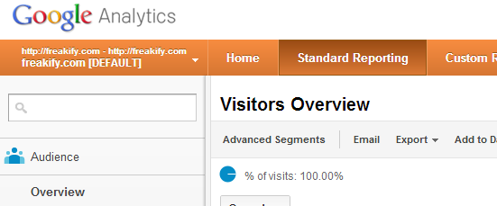
Adsense got a NEW Layout. It is now much similar to other services offered by Google. Google is trying to synchronize the look of every service they offer. Now if you go and browse Google Adsense you will find its UI much similar to Google Analytics
[ad1]
Adsense Gets a NEW Layout
Have a look in the image below to get a little idea about what Google Adsense looks like.

Much Similar to Analytics

[ad]
What’s Good in New Adsense?
- Cool feeling, looks nice to eyes
- It is fast don’t know why but it loads better than the earlier one
You found any other thing? Write & tell about it in comments
Prediction
Here is a little prediction, Google is about to update feedburner’s look now.
[ad]

14 replies on “Adsense Gets a NEW Layout”
nice look and waiting to see it for my blog also…
Hey Ahmed,
I like the new layout of Adsense. It bright and informative at the same time. The estimated earning are given briefly. Thanks for the share!!
May be because my adsense is not approved yet so i;m waiting. Hope it is approved. Anyway thanks for info.
I’m totally up for layouts of front ends been changed. but why does it seem that they’re able to hide all of the important parts when they do make a change. I really hope I can find my way around the new AdSense platform. thanks for the insight.
it all looks fresh and clean to me. let’s face it a change in most cases it’s not for the best. if something works why try and fix it. I suppose though in 2 weeks from now when I’m fully used to the new AdSense platform I’ll be feeling just a home with it as I was the old one.
It is a good one.
It will be easier.
Best of luck with that.
Yes it is fast too.
Hope you got it.
Cool layout. I was wondered when I browsed it through my mobile. Since I was out of the town, I had to browse it from my mobile.
It looks cool and pretty than before!!
Yes it is cool.
I don’t like Blogger new layout
But new Adsense layout looks nice to me
Yes it really is a good one.