When there is a balance required in a web design, grid is the best option regarding to it. Grid-based website designs can easily attract the eyes of the visitors as they are well organized and creatively arranged designs. A grid-design can easily convince the visitors because of the simple structure it has and because of the clear depiction of what your website has in it.
For the demonstration of our words, we are showcasing More than 30 Balanced Grid Based Website Designs.
Paper Beats Internet
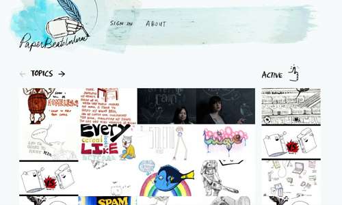
This website uses sketches and drawings since it is a social networking site for showcasing hand-rendered types and images.
Source
Book Cover Archive

An archive of book cover designs and designers
New Quest
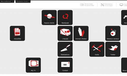
Creative icons in gray, white and red are used for the site’s navigation based on a grid layout.
Source
Ignacio Macri

A website portfolio of logo designer and illustrator, Ignaxio Macri showing his colorful works.
Source
Dynamit

A good manner of layouting having a layout similar to a magazine wherein the images and texts are well distributed.
Source
The Brief

A white background highlights the features of this blog on travel inspirations.
Source
Swinton
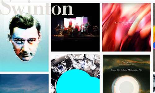
This site showcases personal commissions and artwork by Graeme Swinton using a grid layout.
Source
Salomon Snowboard

You will see more of the website’s beauty with their grid based design as you scroll down.
Source
Craig and Karl
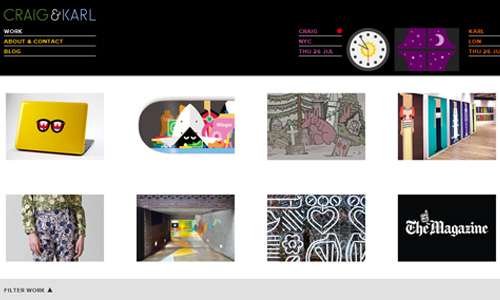
A collaboration of two people with passion in arts who execute their works through thoughtful and humurous illustrations as seen in the site.
Source
Malika Favre

A portfolio of a French illustrator in London who uses lines and colours to convey ideas as seen above.
Source
Sam Dallyn
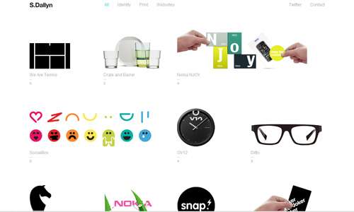
From a creative designer, this website arranged the images based on a grid design that emerged with a unique personality.
Source
Major Tom

Professional looking website for a prominent music company that encompasses recording, publishing and others.
Source
Sylvain Ollier
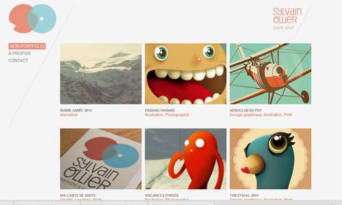
Showing the different works of the graphic designer in each box with white background, letting the designs standout.
Source
Golden State of Mind

Uniquely designed website with a different navigation design.
Source
St. Louis Advertising Agency
You will see how this site made use of grid design all throughout the site if you try to check it.
Source
Avec1y

Images seen on the categories are placed on the homepage for the viewers to take a glimpse of it.
Source
JRVelasco
Another portfolio who made use of grid base design in his layouting of texts and other elements of the site.
Source
Sunil Kalsara
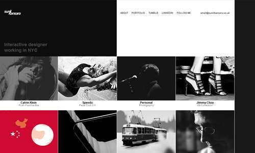
Black and white but still looked beautiful for a designer’s portfolio.
Source
Sylvain Toulouse

Another portfolio of an artistic director and graphic designer made with a personal touch.
Source
Arch Firm
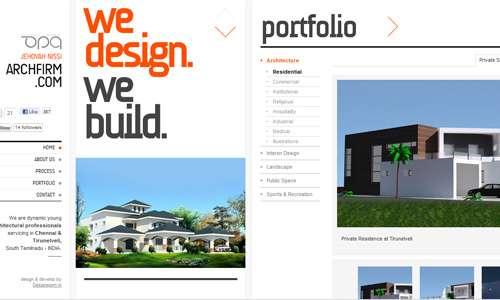
Minimal in approach in presenting the architectural designs of homes and other buildings.
Source
Nice Device
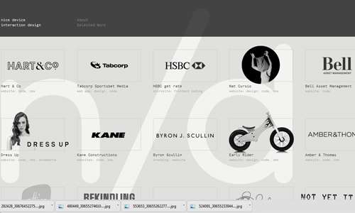
A website for an interaction design studio based in Melbourne that made use of black and white on grid layout.
Source
Beautiful Explorer

A minimal website with the shades of violet on grid design.
Source
Giang Nguyen Design
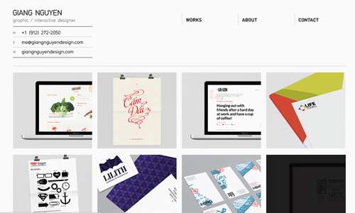
Using grid design for showcasing works is a good way like what this designer did.
Source
Curioos
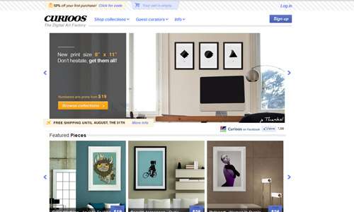
Look into various digital artworks from this site as seen on the images on its homepage.
Source
Yvan Rodic
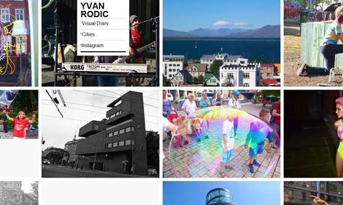
Different photographs from the Yvan Rodic are arranged in a grid manner.
Source
Killingsworth Station

Certainly creative in its use of images and colors for this grid based site.
Download Source
Pixillion
Arranged well with balance and style with a magazine like approach.
Source
Posters in Amsterdam
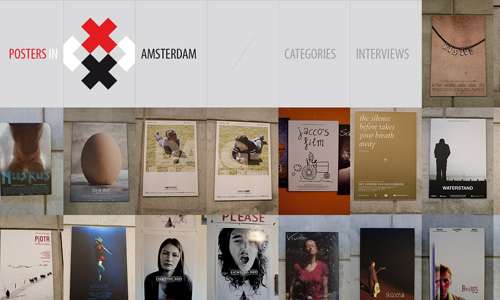
Different posters are showcased in this site arranged in a grid-based manner.
Source
Landor
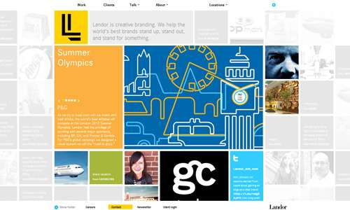
This site looks beautiful especially with the use of some images on watermark.
Source
Dazed Digital
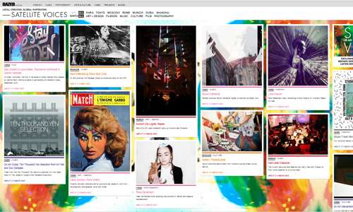
Appears comic-like with its choice of colors and the good layouting.
Source
Faebric
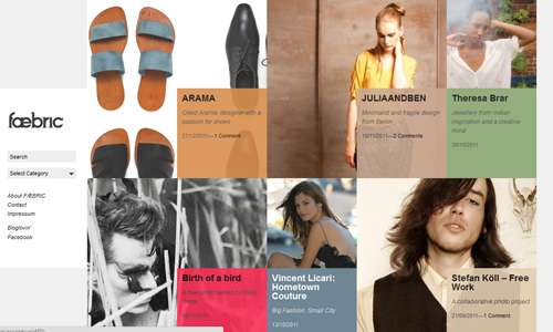
Overlapping images and boxes with text are done based on grids that made this site look fantastic.
Source